Case Study:
Designing the Next Generation Investment
Dashboard — U.S. Bank
Overview
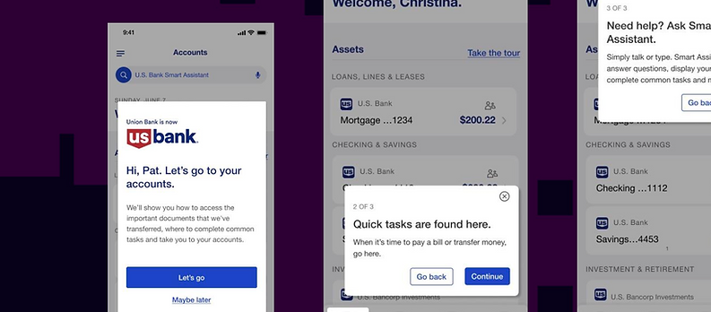
As Senior UX Designer at U.S. Bank, I led design efforts for a new Next Generation Investment Platform, delivering a modern dashboard and integrated trading functionality. The initiative aimed to empower both seasoned investors and everyday banking users entering digital investing for the first time.
Tools
Figma, Accessibility Standards, Financial APIs, Stakeholder Workshops, Jira Confluence
Services from U.S. Bank
500 Billion in assets and cash
Full suite trade and sell capabilities
Title
Lead Experience Designer

Next Generation Investment
Dashboard — U.S. Bank
Designing the Next Generation Investment Dashboard — U.S. Bank Investments
Overview
At U.S. Bank, I was part of a multi-year effort to modernize our investment platform. The existing experience felt fragmented: portfolio views were static, trade actions lived in separate tools, and navigation was intimidating for first-time investors. My role as Senior UX Designer was to reimagine this journey, creating a Next Generation Investment Dashboard that could serve both seasoned investors and everyday banking customers just starting their digital investing journey.
The challenge wasn’t just visual refresh—it was about reducing friction, instilling trust, and meeting strict compliance standards while still pushing toward innovation.
Challenge
The bank’s investment products had strong underlying capabilities but weren’t easily accessible to users:
-
Portfolio dashboards only displayed limited snapshots, forcing customers to dig deep for insights.
-
Executing trades required multiple context switches, slowing down decision-making.
-
Navigation patterns reflected legacy systems, overwhelming new investors with complexity.
At the same time, U.S. Bank operates in a highly regulated environment, where every design choice needed to account for compliance, risk, and accessibility requirements. This meant my design process had to balance clarity, compliance, and innovation at every stage.
Role & Approach
As the lead designer for this initiative, I partnered closely with product managers, compliance officers, and engineers. My approach unfolded in three key phases:
-
Discovery & Research
-
Conducted workshops with compliance, risk, and investor relations teams.
-
Interviewed users across experience levels to understand pain points with existing workflows.
-
Benchmarked competitor platforms to identify gaps in personalization and accessibility.
-
-
Design & Prototyping
-
Created wireframes, interactive prototypes, and high-fidelity designs in Figma.
-
Mapped seamless trade execution flows, reducing steps from portfolio to confirmation.
-
Embedded AI-assisted insights to guide users with personalized account suggestions.
-
Applied WCAG 2.1 AA standards to ensure accessibility for all user groups.
-
-
Delivery & Iteration
-
Collaborated in Agile sprints using Jira for task tracking and Confluence for documentation.
-
Partnered with compliance/legal to integrate safeguards directly into user flows.
-
Ran multiple rounds of moderated usability testing, refining based on satisfaction scores and drop-off data.
-
Solution
The final Next Generation Dashboard introduced:
-
Real-time portfolio visualizations with customizable views.
-
Integrated trading flows—users could go from viewing holdings to trade confirmation in just a few clicks.
-
Clear compliance indicators built into the UI, ensuring users understood guardrails.
-
AI-powered insights surfaced responsibly, giving confidence without overwhelming.
-
Inclusive design standards, making the product equally usable across demographics.
This wasn’t just a dashboard redesign—it became the foundation for how U.S. Bank would integrate AI and modern UX into its digital wealth ecosystem moving forward.
Results
The redesign delivered measurable impact:
-
40% faster trade execution flow (from dashboard to confirmation).
-
91% satisfaction rate across mixed experience levels in usability testing.
-
5,000+ early access users piloted the platform, validating roadmap direction.
-
Improved alignment between design, engineering, and compliance, accelerating future releases.
Tools & Methods
-
Figma (UI/UX prototyping, design systems)
-
Accessibility Standards (WCAG 2.1 AA compliance)
-
Financial APIs (real-time trading data integration)
-
Agile Collaboration (Jira & Confluence for sprint planning and documentation)
Reflection
This project reminded me how important it is to sweat the small stuff—microcopy, icon clarity, even animation timing. I loved the fast pace of solving real user pain with small, high-impact improvements. It also strengthened my ability to own a full journey while collaborating tightly across disciplines.
