
Case Study: Onboarding of Union Bank
Context
During a major platform merger at U.S. Bank, our team was tasked with enhancing the onboarding experience for mobile banking users. The objective was to ensure a consistent and seamless experience for both new users and existing U.S. Bank Systems. Our goal was to deliver a friendly, trustworthy, and informative experience that showcased new features and the U.S. Bank application.
Tools
Figma, Accessibility Standards, Financial APIs, Stakeholder Workshops
Services from Union Bank
500 Billion in assets and cash
28 Diffrent User Accounts not including multi accounts
Title/ Team build
Lead Experience Designer (myself)
3 content designers
1 accessibility consultant
4 designers (overseas)
3 development teams

Union Bank Case Study
U.S. Bank / Union Bank— Designing the Onboarding Experience During Platform Merger
The Challenge
During the merger of U.S. Bank and Union Bank, our design team was tasked with a high-stakes challenge: to unify two vastly different mobile banking experiences into a seamless platform. For both new and existing customers, the onboarding process would be their first impression—a crucial moment for building trust in the financial services industry. If users encountered friction or confusion during sign-up, their adoption and retention would suffer.
My Role
As the Lead UX Designer, I spearheaded the design of the comprehensive onboarding experience for new Union Bank users. My team’s objective was to create a straightforward, intuitive, and trustworthy onboarding process for Union Bank users who are unfamiliar with U.S. Bank, all while adhering to the stringent security and compliance standards of the highly regulated finance industry.
Approach
-
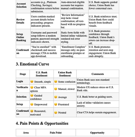
Conducted usability tests with customers from both banks and union bank subject matter experts to identify frustrations in current workflows and mismatches. These insights were then compared to competitor fintech apps to discover best-in-class onboarding practices. Presenting these findings to stakeholders helped define the approach and essential features.
-
Journey Mapping: We identified a need and mapped the entire user flow, from the initial app open to account setup and login. Consequently, I created the most extensive journey map I’ve ever made. (I exceeded the app’s memory limit in the process.) This involved identifying all the opportunities to reduce steps and eliminate redundant verification requests for the union customers onboarding to the bank.
-
Consistency through Design System: I applied the enterprise design system I had helped evolve with Union Bank white label based on brand guide, ensuring consistent visuals, typography, and interaction patterns across both platforms. This was crucial in creating familiarity for Union Bank users transitioning to U.S. Bank.
-
Trust & Transparency: Trust and transparency are paramount. To enhance user confidence during sensitive tasks like identity verification, we incorporated universal footer microcopy, a progress indicator, and accessible UI patterns. These elements explained each step in plain language, reinforcing user confidence throughout the process.
The Solution
We implemented a two-phase solution. Phase one involved creating a website that showcased the merger and outlined the expected changes in the coming months. Additionally, we streamlined the onboarding process across various platforms, significantly reducing the time to the first login by simplifying registration and verification steps. Users were clearly guided through the process with a contextual guide, transparent progress indicators, and ADA-compliant design. This ensured that users only needed to enter new login information from different bank channels. This approach created consistency between the legacy Union Bank and U.S. Bank apps, making the transition seamless for customers. Furthermore, we introduced an Introduction tour using Pendo as the Guide, highlighting new features that Union customers previously didn’t have and addressing stakeholder requests for a paperless sign-up interstitial.
Impact
-
25% reduction in drop-off rates during onboarding.
-
73% paperless adoption
-
91% satisfaction score in usability testing for new-to-bank customers.
-
A smoother onboarding journey that built long-term trust and supported the bank’s larger merger strategy.
The Outcome
By unifying the onboarding experience, we ensured that thousands of Union Bank customers entering the U.S. Bank ecosystem felt at ease and supported. The project not only elevated first impressions but also laid the foundation for long-term digital engagement in the new platform.


_tiff.png)
.png)


Union Bank What to expect Splash page example (multiple versions, changed with merger and onboarding of banks parts)

Onboarding wireframe Example with Pendo tour screens

Paperless preferences campaign that was created
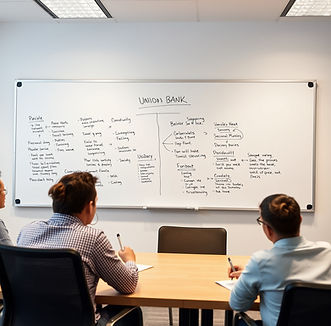
Journey Map Example